In the realm of design, whether it be in fashion, interior decoration, or graphic design, the selection of color palettes plays a pivotal role in conveying emotions, establishing brand identity, and creating visual harmony. One of the most frequently asked questions among designers and enthusiasts alike is: What three colors go well together? This inquiry transcends mere aesthetics; it delves into the principles of color theory, psychological impact, and cultural significance. In this post, we will explore three expertly curated color combinations that not only complement each other but also serve specific design purposes.
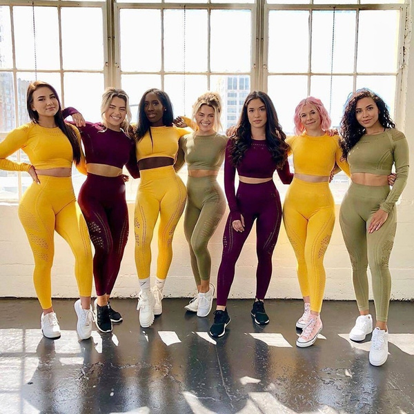
- The Classic Trio: Blue, Yellow, and Gray
Color Psychology and Application:
Blue evokes feelings of calmness and trust, making it a popular choice for corporate branding and healthcare environments. Yellow, on the other hand, radiates warmth and optimism, stimulating creativity and energy. Gray serves as a neutral backdrop that balances the vibrancy of blue and yellow, providing a sophisticated touch.
Practical Use Cases:
- Interior Design: This combination works beautifully in modern living spaces. A soft blue wall can be accented with yellow cushions and gray furniture, creating a serene yet lively atmosphere.
- Branding: Companies aiming to project reliability and innovation can utilize this palette in their logos and marketing materials. For instance, tech startups often incorporate blue for trustworthiness, yellow for creativity, and gray for professionalism.
- Earthy Elegance: Olive Green, Terracotta, and Cream
Color Psychology and Application:
Olive green symbolizes growth and harmony, making it an excellent choice for brands focused on sustainability. Terracotta, with its warm, earthy tones, brings a sense of comfort and connection to nature. Cream acts as a soft neutral that enhances the richness of the other two colors without overwhelming them.
Practical Use Cases:
- Fashion: This palette is perfect for autumn collections, where olive green dresses can be paired with terracotta accessories and cream outerwear, creating a cohesive and inviting look.
- Interior Design: In home decor, olive green walls can be complemented with terracotta pottery and cream textiles, fostering a warm and inviting environment that feels both contemporary and timeless.
- Bold Contrast: Teal, Coral, and Charcoal
Color Psychology and Application:
Teal is a refreshing color that combines the tranquility of blue with the invigorating qualities of green. Coral adds a vibrant pop that energizes the palette, while charcoal provides depth and sophistication, grounding the brighter hues.
Practical Use Cases:
- Graphic Design: This combination is ideal for digital marketing materials, where the contrast between teal and coral can capture attention, while charcoal text ensures readability and professionalism.
- Event Planning: For weddings or parties, teal table settings can be accented with coral floral arrangements and charcoal linens, creating a striking visual impact that is both modern and elegant.
Conclusion: The Importance of Context in Color Selection
When selecting a color palette, it is essential to consider the context in which the colors will be used. Factors such as target audience, cultural implications, and the emotional response you wish to evoke should guide your choices. The three combinations discussed—blue, yellow, and gray; olive green, terracotta, and cream; and teal, coral, and charcoal—illustrate how thoughtful color selection can enhance design effectiveness.